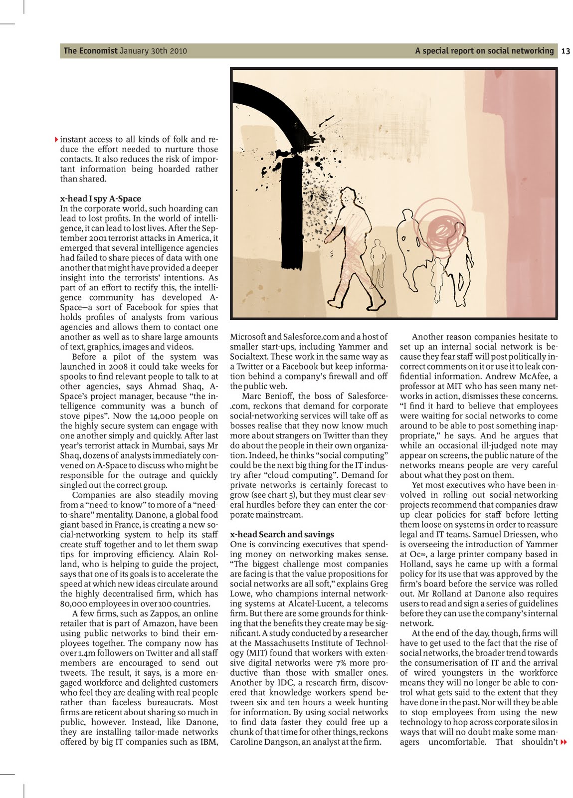
This was an absolutely wicked brief. Although i didn't really take that much to the concepts of the article, the process of creating elements and nurturing my designs was thoroughly captivating and enjoyable. Even though we have been spanked into relieving the focus of working in a distinctive style, in order for myself to really claw my creativity into this project i concentrated on taking influence from David Hughes. He tends to construct his illustrations with multiple elements and subjected layers. I took the tool of initiating more textural parts to fill the compositions. All in all, i think they turned out pretty well but the only negating aspect is the lack of communication alongside the text.
Showing posts with label My Work. Show all posts
Friday, 7 May 2010
Wednesday, 16 December 2009
Door(WAY) Project Retrospective...
Over the course of this brief i unfortunately suffered a hefty lot of absence due to winter eczema inflammations. After approximately one or two weeks of apologetic phone calls and hopeful promises, i managed to join the rest of my group and get up to speed. At this point, it was really a matter of flowing with the propositions the rest of the guys made and as i fully agreed and was satisfied with their outlines, everything subsequently fell into place. After group meetings and minute sessions, we all progressed well with our separate roles and our intentions came to fruition smoothly. As a group we accomplished a hell of a lot apart from just the work. We huddled comfortably and harmoniously, giving each other helpful feedback as well as consistent support.
The concept of the brief was very open-ended leaving plenty of room for our adventurously creative tendencies to run wild. From the beginning, the rest of the guys brainstormed, coming up with numerous ideas; looking at the essence of what could be lurking on the other side of a door, another world, a monster, time travelling through a doorway, working with things like dreams and emotions, how the experience of walking through a doorway can affect the senses and so on. There was also a key emphasis on a dollhouse. These all began as brief components to snowball with. We settled for a while on the concept of a doorway being part of a psycho ward and how we could initiate it as the envelope to some form of paranoid experience for the viewer. This led us to divulging in reference to films such as `Being John Malkovich`, `The Lion, The Witch and The Wardrobe` and `Alice in Wonderland` as well as various others.
Thanks to Elizabeth who had researched her ass off bringing many references to the table, she declared the idea of incorporating some form of mask into our work. This happily became a malleable focus to our progression and i, through no fault of my own, took up the pedestal to being the model. She had uncovered an image that looked as if someone had taken photographs of their own or somebody elses head then transferred these pictures onto some fabric and stitched the pieces together to function as a mask. We basically did the same by taking each profile shot of my head then applied it to transfer fabric and Elizabeth finished off the stitching. It was very successful.
After a full group minute session with our project mentor, Esther Freeman, we had an indulgent step back from our work and opinionated the stage at which we were currently at. We concluded that the primary foundation of our idea lacked slightly in substance and was blurry with how we could proceed with it further, especially in relation to how it could be exhibited. As a group we took the chance to transiting to a completely separate idea focusing more on the nature of the urban environment and how this can be viscerally transfused to the viewer. I think this was when we definitively decided we were to create a film as one element of our final product.
Our emphasis became more orientated toward the year trip to New York, which only myself and Steve attended. Unfortunately Elizabeth and Edwina did not have the money to participate. We deliberated over our preparations and everything that was necessary for each of us to do during mine and Steve's leave. The vacation obviously fitted really well with our momentary halt, as we could attain many references as well as as much footage as possible. Because of the set-up of the trip, myself and Steve ended up staying in separate accommodation, so it was difficult to be able to rendezvous and work together. Also not being able to actually get in touch made it practically impossible to coalesce. Overall though, the trip was awesome.
By the time we had returned Steve had collected the perfect amount of wicked footage that would compile just nicely as a montage of our decided storyboard. During mine and Steve's absence the girls were able to finish up the construction of the box pasting it with as much urban crap as possible and giving it a nice run-down glaze. By this point there was approximately one week left before the final deadline.
This was quite an intense period. All that needed to be done was to place and construct our door within our designated space, attain some black curtains and set them up as a backdrop for our door, collect shit-loads of garbage to scatter around our exhibition space, attain a plinth to display our research book and our mask, install a disco ball for behind our door, edit the footage we received and form a video, attain a Mac to display within our doorway tunnel and present our video...and be satisfied with it all. Throughout this time i think we all pulled our weight and managed very well.
In conclusion, i think we all deserved a small applause for the effort that we all put in and as a group i think we have walked away very much delighted as well as relieved to have come to the end. It was wicked to have had the chance to work collaboratively once again.
Here is our final installation entitled `There's Two Sides`.
Wednesday, 4 November 2009
Mulberry Fashion Brief...
Okay, just to state now, i am not the biggest fan of fashion. Clothing would have to be one of my major flaws to representing any sense of my own personal style.
The brief that we have been given is to produce a design to work as different elements within a Mulberry store. The main requirement is to incorporate this design into a 15cm x 30cm format to act as a huge carpet. The elements that are required should work as separate motifs as they would be used to decorate around the store.
Apparently Mulberry attempt to combine `the cool of the city with the craft of the countryside`. Personally, i think that's a load of wank. On the Mulberry website their recent selection of glamorous things have no style, no etiquette of originality or substance, every item seems to identify one spot colour and some kind of fancy material that will complement an eye-popping price. They are empty residues of crap.
This being a slight dilemma as where to begin, i was very unsure of how to make such a cool and crafty combination. I decided to venture for some different resources and purchased a Vogue magazine. This helped a lot.
Utilising such pretty pictures contained within, i initiated some templates from whatever was feasible and drew out some basic shapes. After further inductions in Adobe Illustrator, i began reworking my sketches and transformed them into Vector shapes.
I became a little subdued by how i couldn't actually integrate any of them into a basic composition. My initial idea was to incorporate the selection of shapes i had and copy them over the template, however, after a few attempts,it kinda ended up looking similar to something along the lines of Matisse which didn't really fit the brief in my eyes.
After major frustration nearly resulting in suicide, i just kept it all simple and using some novice tools on Illustrator repeated some of me shapes and made some circular patterns out of 'em...
and here we are...
Saturday, 10 October 2009
mi animacion...
...and here we are.
after dealing with the problematic ways of AfterEffects i had 48hrs to come up with some form of moving imagery. Fortunately after having some past experience with iStopMotion, i was quite comfortable with the process and therefore had a faint idea of what to undertake. Applying my two original characters from my previous project, and making a few slight changes to make them easier to incorporate, i cut each ligament out seperately to be able to manipulate. My initial idea was to set out a small story with each full character, having them approach each other from either side of the background then somehow merging in the centre. After playing around for quite sometime experimenting, i found the eccentricity of the movement too fun to keep to a basic storyline and therefore went a bit senseless. Utilising my original backdrop from AfterEffects, my tutor suggested integrating the essence of charcoal, perhaps outlining smoke from the chimneys of the houses. I then used pencil to keep the detail quite crisp and clear for the movement of the smoke only because my backdrop was sketched out in fineliner and i thought charcoal may have been too heavy to mix with. Overall, i am pleased with the result, however i think i could have added more features such as sound effects or difference in lighting and combined these in some editing software.
Wednesday, 30 September 2009
Vernon Mill Artists
i have just recently taken up a studio space in Vernon Mill in Stockport. it is quite a wonderful place. it has many nice people and lots of pretty pictures and paintings. i recommend a visit...
there is a public exhibition during the October month of this year to be able to view the work and meet some of the artists...
as i do not want to infringe any copyright by placing any artists work on here, take a look at the website...
http://www.vernon-mill-artists.co.uk/vma2005/index.htm
there is a public exhibition during the October month of this year to be able to view the work and meet some of the artists...
as i do not want to infringe any copyright by placing any artists work on here, take a look at the website...
http://www.vernon-mill-artists.co.uk/vma2005/index.htm
Subscribe to:
Posts (Atom)